Grit
(Brand Identity for a social impact brand that empowers American businesses & workers)
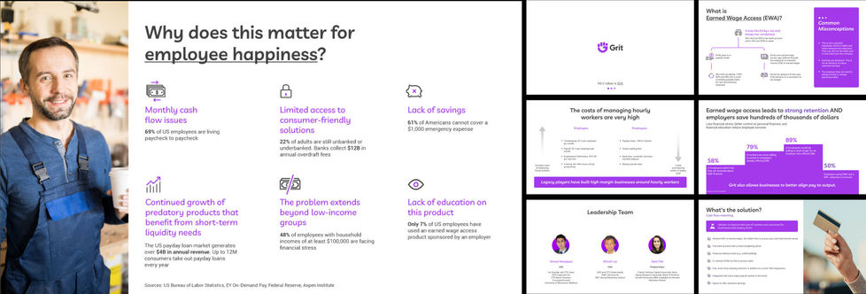
Grit provides instant earned wage access to American Workers at no cost to them or their employers. They do this to help reduce financial stress for businesses & workers.
They wanted to build a cohesive identity system that could encapsulate their offerings.
We started with defining the brand anchor:
Brand Anchor

Having defined the core of the brand, we started looking at different concepts for their logo

Final Logo

+

=
Brand Initials
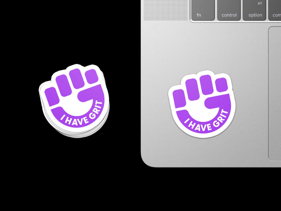
A symbol for empowerment

Symbol

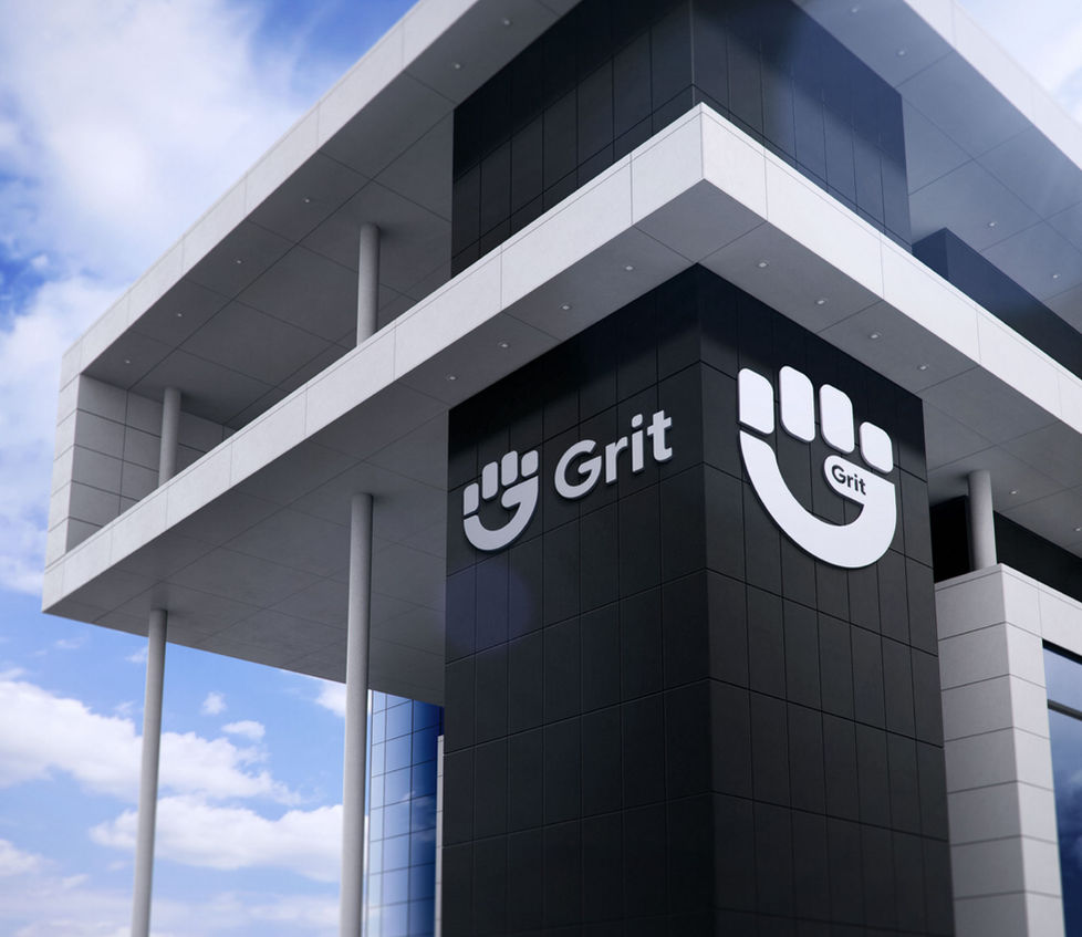
Combination Mark

Compact Combination Mark
For their visual language, we looked for images related to 'Grit'. One of the common images we found was of these gritty sandy stones. So, we simplified it


Coincidentally, this also looked like stars in a night sky. This was interesting because looking at stars in the night sky is often associated to being a peaceful & a stress relieving activity. Which would be good feelings to evoke as a brand. With this, we ended up with 3 key shapes for their brand:

We call these: "Pieces of Grit"
We also developed custom duo-tone icons for their brand

Thank you for watching!


