Burger King vs McDonalds! (Opinion Piece)
- Arun Gopidas
- Mar 7, 2021
- 2 min read
I won’t be surprised if I was one of the few people to not have eaten from McDonalds or Burger King since the pandemic started. But I was quick to notice both go through noticeable design changes last month.
I remember as a child I would go to McDonalds and snack on those happy meals. It wasn’t the burgers but the toys that really sold happy meals to me as a kid.
As an adult, I still favor McDonalds over Burger King. I believe it has less to do with taste and more to do with availability. Burger King didn’t launch in India until 2015.
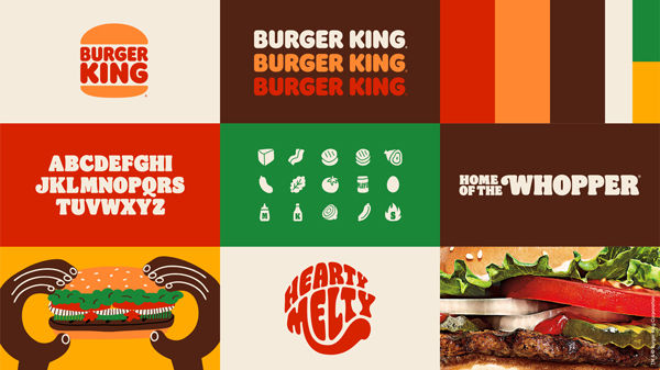
But my personal equation with these two brands changed in February of 2021. These rival brands went through some drastic design changes. If you follow Gopigraphy on Instagram, you’ve already seen the excitement we had for Burger King’s rebrand.
Jones Knowles Ritchie (JKRGlobal) lead the rebrand for Burger King while McDonalds was led by Pearlfisher. Both brands seem to have gone back in time, McDonalds seems to have taken subtle cues from Turner Duckworth’s rebrand:

While Burger King proudly goes back to the logo it had in 1994:

For many this might seem nostalgic, not for me though, I never saw the 1994 logo before this current rebrand, but it has my heart. It’s so simple it’s perfect. I never noticed the glossy burger in their old logo, but it comes to the forefront and is impossible to miss in the newer version.
Both brands feel distinct in their tone & design. Burger King feels more chunky and quirky:


While McDonalds feels crisp and neat:


While both brands did a pretty good job, Burger King feels a lot more fresh and authentic. I can’t recall any other brand using a similar illustration style, and this is where McDonalds feels lacklustre in comparison, that clean minimal look isn’t new.
While it does seem like a move in the right direction, I feel it could have been better timed. McDonalds just feels weak when compared to the delightful route Burger King had taken. Had McDonalds not released their identity right after Burger King did, it might have escaped the inevitable comparison.
Also, as a side note, what impressed me the most was not the rich bold colors, or the expressive visual systems. It was this subtle & cute monogram from Burger King that I can't stop thinking about. I don't think I need to explain this one 😉

So, which brand do you think did it better?


Comments